
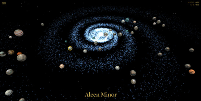
Are you also waiting for the new Star Wars: Episode VII? If yes we’ve got something for you. The design agency nlcud has put together an interactive map of The Galaxy which will allow you to explore it planet by planet.
The map has a couple of cool features. You can easily jump between planets and get info about their details like the size, year, climate, terrain, population and length of day. It also tells you what movies the film appears in. You can also sort planets by each of the films.
The app is not very impressive but if you can’t wait for December, it will be enough to make you love it:)
The app works only on Chrome.

#Featured

Next article
Kyle Walker, assistant professor of geography at Texas Christian University created an interesting project. He took data about immigrants from the latest 2010 Census and mapped region or country of origin of each and every of them. The effect is a dot-density representation of the US immigrant population.
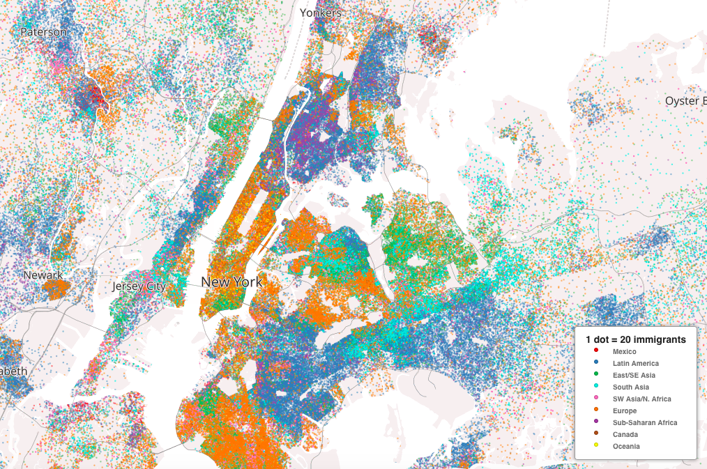
New York
Immigrant regions include:
- Mexico (red);
- Latin America and the Caribbean, other than Mexico (blue);
- East and Southeast Asia (green);
- South & Central Asia (aqua);
- Sub-Saharan Africa (purple);
- North Africa & Southwest Asia (pink);
- Europe (orange);
- Oceania (yellow);
- Canada (brown)
In New York, we see that the majority of Manhattan’s immigrants are European, which the East/Southeast Asian cluster on the Lower East Side and the Latin American population above Central Park. Nearly all of the Bronx is dotted dark blue for Latin America, as is northeastern Brooklyn. Northwestern Brooklyn, Northwestern Queens, and Southeastern Queens are predominantly European, while Northeastern Queens is a mix of South Asian and Latin American.
This map was inspired by similar a similar visualisation of US racial segregation. instead of each dot representing one person it represents 20, and instead of the colors representing race they indicate a native region.
Tools used to make this map? A combination of R, QGIS, ArcGIS, and Python for data processing and Mapbox for the web presentation.
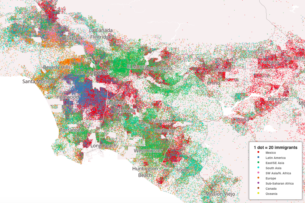
Los Angeles
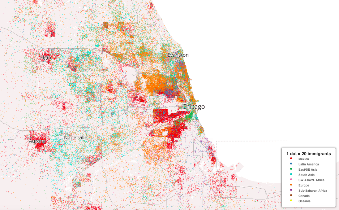
Chicago
Cool map.