
In India, pollution has become a way of life. The air quality index regularly screams ‘hazardous’ and it’s not uncommon to see schools shutting down because of smog or citizens going to work wearing anti-pollution masks. And lest anyone forget how badly the country is choking on poisonous air, European Space Agency’s Sentinel-5P satellite has come out with a shocking reminder of the same in the form of the following image:
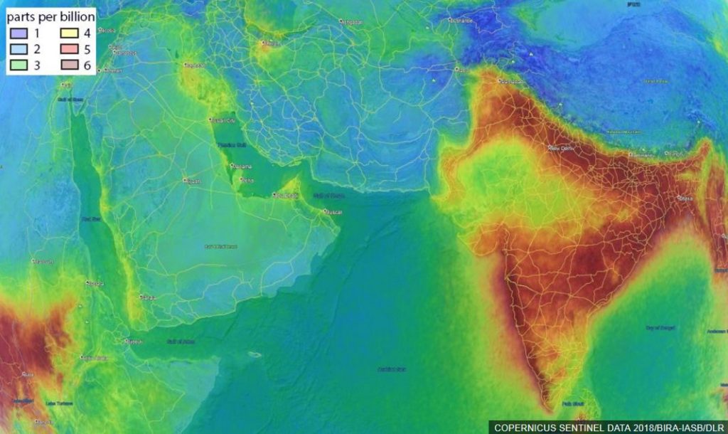
What you see here is the concentration of formaldehyde in the air, as measured from November 2017 to June 2018. Formaldehyde is a colorless gas produced naturally by all life forms as a part of cell metabolism. However, the amount of naturally-occurring formaldehyde is very, very small – which is a good thing because if you breathed in a lot of this gas, you could experience server respiratory problems. The US Department of Health and Human Services has, in fact, said that prolonged exposure to formaldehyde could lead to cancer in humans.
So, why is formaldehyde plaguing India in the first place? In an interview with the BBC, Isabelle De Smedt from the Royal Belgian Institute for Space Aeronomy (BIRA-IASB), says, “It depends on the region but 50-80% of the signal is from some biogenic origin. But above that, you have pollution and fire. And the fire can be from coal burning or wildfires, but in India, yes, you have a lot of agricultural fires.” This is why you see lesser concentrations of formaldehyde over the desert area of Rajasthan in the image above. But clearly, India needs to act. And fast.
Data and insights like these are important to help countries formulate policies that could tackle the menace of air pollution in a timely manner. And ESA’s Sentinel-5P satellite is set to play a big role in this. Sentinel-5P carries the most-advanced pollution mapping sensor of its kind: Tropomi. Its ability to image air pollutants in more detail than ever before is certainly going to ensure that the dialogue around air pollution does not die down.

#Business


Next article


As I was listening to the radio this morning I was saddened to hear that yet another cyclist had been killed on Australian roads. This time the victim was a 27 year old Dutch girl, riding in the bike lane on a Sunday morning down an inner city street in Melbourne. Earlier this year an alumni from my school was hit and killed by a truck while road cycling in Sydney.
Two young lives taken and unfortunately just a small part of a much bigger picture both in Australia and worldwide. There is a broader takeaway here around the dangers of shared infrastructure – as cycling rises in popularity, cycling fatalities as a percentage of total road deaths have increased across most countries in the OECD. This is why governments with the foresight and the right means are building separate bike paths – to reduce the instances where bikes and cars need to interact.
This is easier said than done, particularly in built up cities where real estate is hard to come by. The immediate costs are also significantly higher. With this approach, not only does the government need to continue funding road construction, they need to construct new intersections, bridges, paths, and signage for the dedicated bike routes. Questions thus arise. Which routes should be prioritised? Where are bike lanes sufficient? Where are under/over passes necessary?
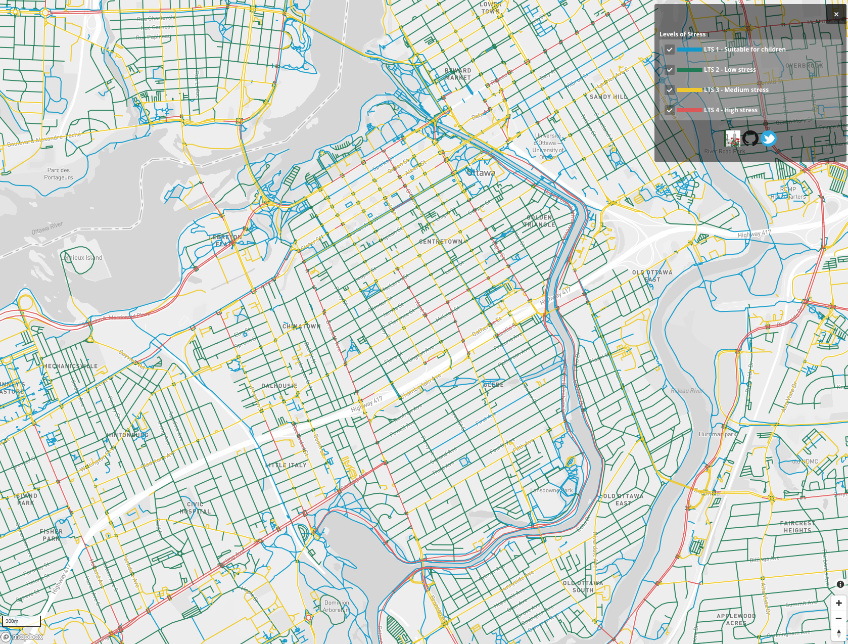
Luckily some of the answers to these questions have been emerging – sometimes from government, but increasingly from the citizens who rely on this infrastructure on a day to day basis. Bike Ottawa, the cycling advocacy group from Canada’s capital, is a great example.
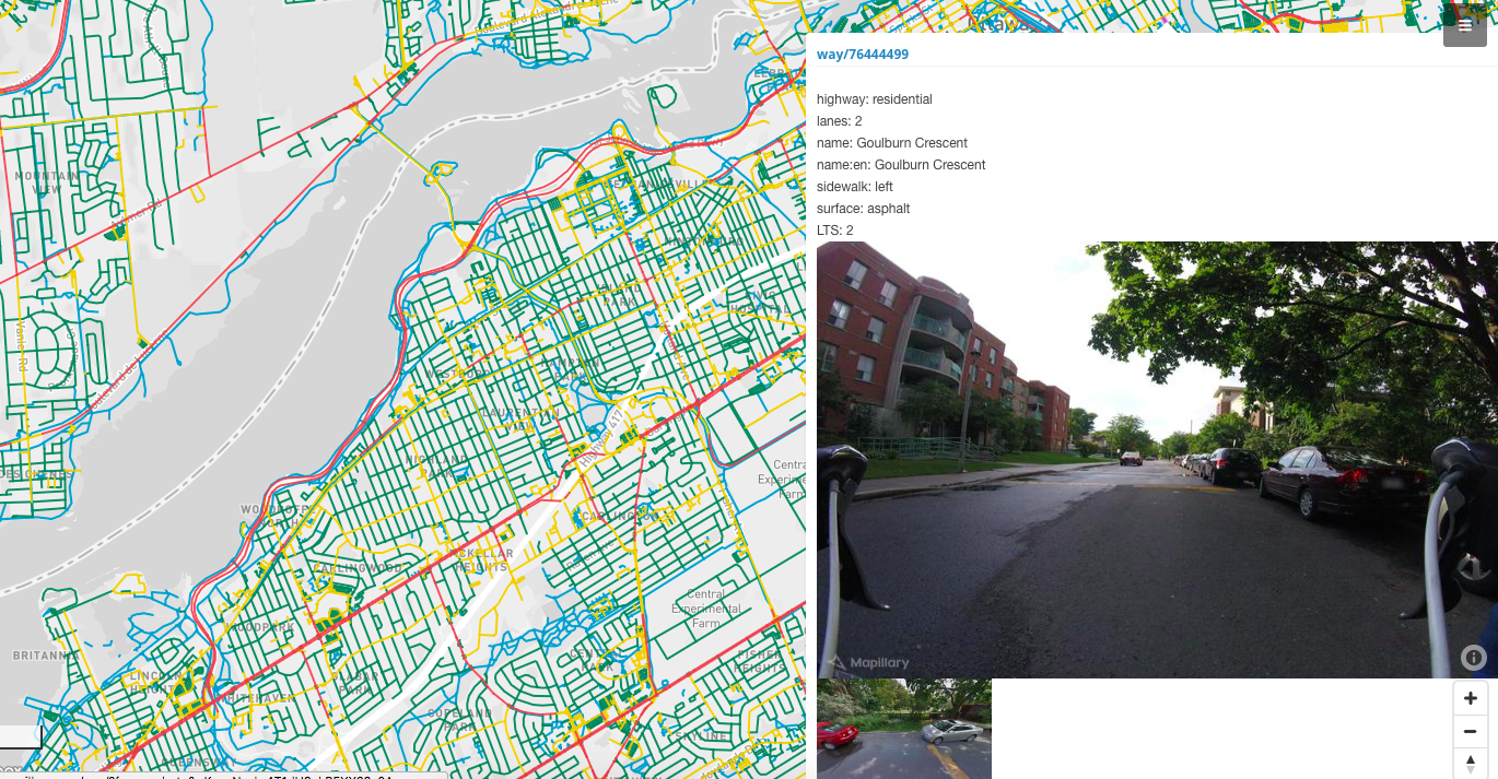
Bike Ottawa continuously assess new roads being constructed. If they identify a section of road that poorly caters for cyclists, they raise the issue with city authorities in a well researched, analytical way. Among other things, they’ve collected extensive street-level imagery from the perspective of the cyclist, using action cameras and smartphones. Once the imagery has been uploaded to platforms like Mapillary, it’s used to create a better understanding of the city. This is done in a number of ways.
Firstly, the imagery is available within OpenStreetMap, a free and editable map which has become one of the world’s most widely used map sources. Anyone looking at an image of a street in Ottawa can use it to improve map data related to cycle routes. This can include the surface type, direction of travel, speed limit, shoulder/path width, and other factors that influence the safety and navigability of routes. This data underpins userful tools such as the routing and traffic stress maps Bike Ottawa provides.
Secondly, the imagery can be embedded in a number of places, whether it’s an advocacy report or a dedicated page providing a visual reference to the cycling conditions in that location. This gives their fellow cyclists, policy makers, and any interested party an easy avenue to observe and communicate on existing infrastructure.
Thirdly, one way to measure success for a group like Bike Ottawa is the improvement in bike related infrastructure. This influences important metrics like cycling related deaths and incidents, the number of commuters cycling, and the efficiency of cycling routes as a viable transportation option. Street-level imagery and the map data it generates give citizens a way to track progress or the lack thereof as often as they collect the data, making them less reliant on traditional top-down dissemination of information.
Bike Ottawa is just one of many groups and people that move the needle. Other examples include Liga Peatonal, a pedestrian advocacy group in Mexico, Wheelmap, an organisation improving wheelchair accessibility, and Fernando Benitez, a PhD student who has been working with the Valencian government to create more detailed cycle maps – all three use street-level imagery and map data to support their respective causes.
Hopefully these developments will highlight safety concerns in a way that, among other things, halts the number of fatal bike accidents. An important part of this is that it’s now easier than ever before for citizens to help shape their cities and towns in a way that makes sense to them. This can only ever be a positive thing.