
Seven-tenths of the surface of the planet we call home is Ocean and yet we have barely explored the depths of the oceans. Going by some reports, we probably know more about the surface of Moon and Mars more than we know about our Oceans. But that doesn’t mean we know nothing, there are maps of the entire ocean floor with a spatial resolution of a 5km (Gravity map of the Oceans).
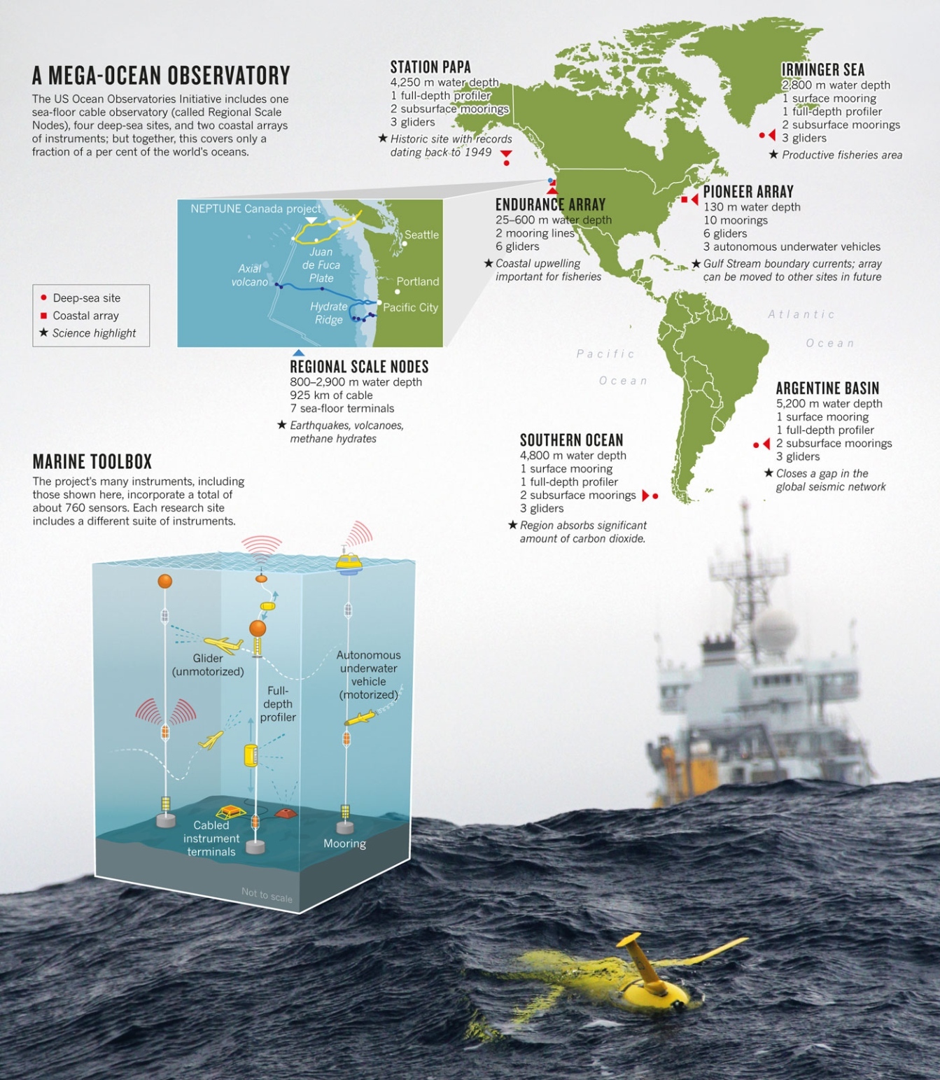
Image: ALLISON FUNDIS; UNIV. WASHINGTON via Nature.com
Global Monitoring Network for the Oceans
The oceans are the largest reservoirs for absorbing the excess CO2 in the atmosphere, while Space exploration is perhaps more cooler and futuristic (and equally important), ultimately our understanding of the oceans might prove more useful if we are to model the effects of Climate change in the best manner possible.
A few years ago, the National Science Foundation in USA funded the Ocean Observatories Initiative through the Consortium for Ocean Leadership, to help set up a global monitoring network of the oceans to provide real-time information that will help researchers understand the consequences of all this extra carbon for the health of the ocean’s chemistry and biology besides helping understand the role of the Oceans in Climate change.
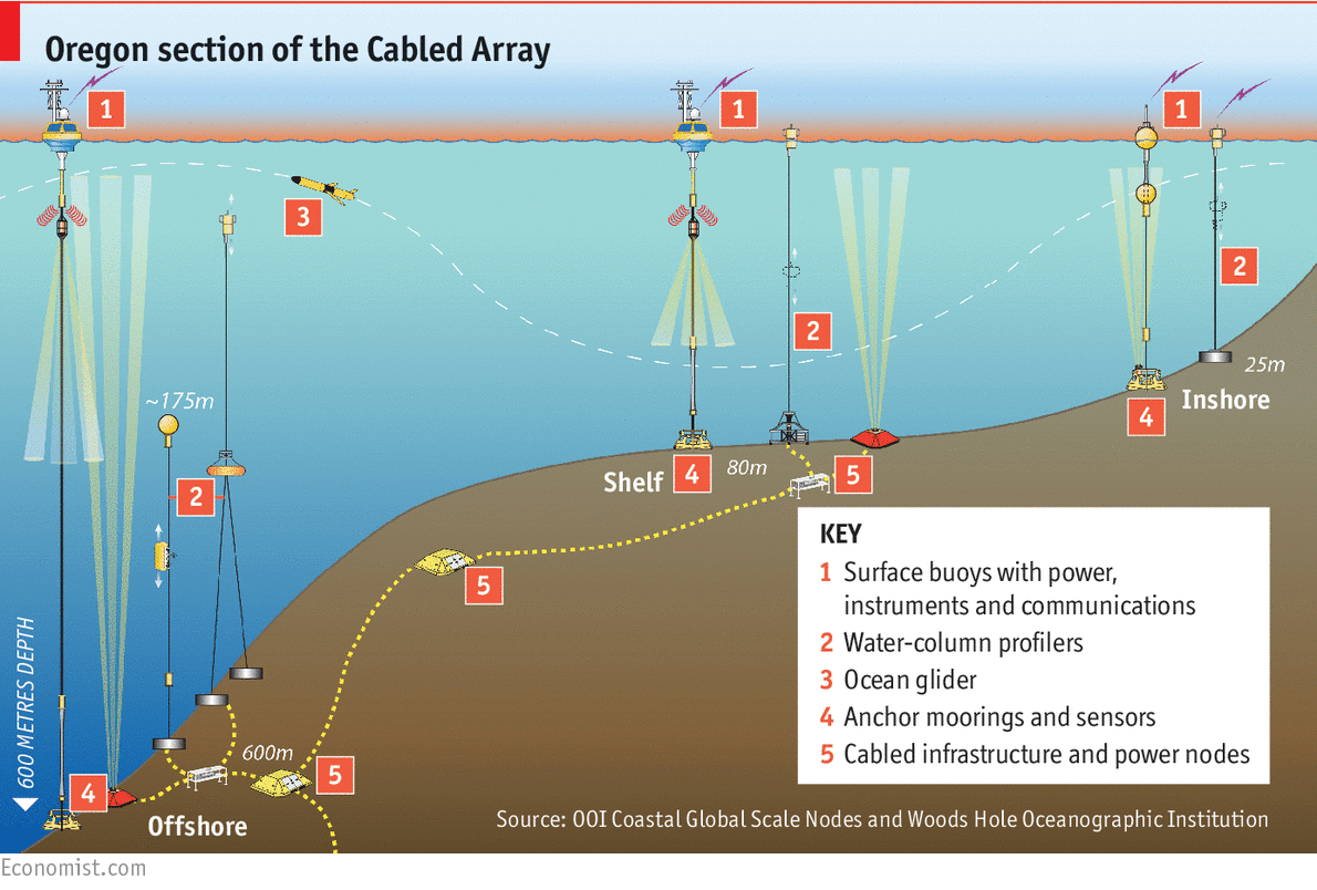
According to a new report by the Economist, In June, the 7 sites of the Ocean Observatories Initiative (OOI), located around the Atlantic, Pacific and Southern oceans will join three Canadian facilities and the Arctic observatory in Cambridge Bay. These observatories will measure physical, chemical, geological and biological phenomena from the seabed to the surface.
How do we visualize all this data?
 All this data might be super interesting for researchers in the field of Oceanography, Marine biology, Climate change, et.al but if our experience with Geospatial analysis is any guide, the public is not that easily impressed.
There are several cool ideas and interesting maps from data that isn’t necessarily spatial (Read: What information can be mapped?). While data from these network of sensors from the Ocean observatories definitely has a spatial connection, it would be interesting to see how best we can come up with new ideas to map it.
The Ocean Observatories are collecting data about the physical, chemical, geological and biological phenomena from the seabed to the surface. Some of this might be extremely interesting for the public say what species lives at what depth and so on, but is a simple 2D profile map the best visualization of this data? Definitely not!
3D Maps and Augmented Reality?
Data from the Ocean Observatories are 3 dimensional, extending all the way from the surface to the ocean floor. Thanks to increase in computing power and graphics, GIS software these days can create real 3D models (instead of the 2.5D models of yesteryear). Some of them even have a specialized Ocean GIS package (Read: Taking GIS underwater: The Ocean GIS Initiative).
3D models might be a great idea to visualize the data but I am not entirely sure if the idea of a 3D model for a city can be directly applied in the case of the oceanographic data.
We might already have the Hubble of the Oceans generating the data for us, it is time for us Geogeeks to think what would be the best way to visualize all this oceanographic data
Got any cool ideas for visualizing the data? Let us know 🙂
Read more:
- Wiring the world – Economist
- Oceanography’s Billion dollar baby – Nature
- Why the need a Hubble for the seas – CNN


#Science


Next article
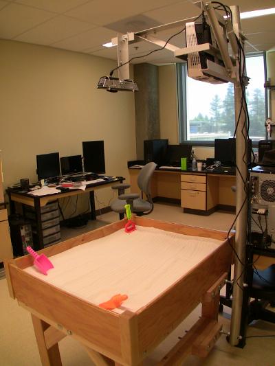 Recently I came across one of the coolest applications of augmented reality ever. Couple of researchers from UC Davis Center for Active Visualization in the Earth Sciences have developed a sandbox that acts as a real-time interactive, topographical map with contour lines and color shading. When ever you change the topography by moving the sand, the new isolines will be projected on the sand.
The project uses Microsoft Kinect camera coupled with topographic visualization software and a 3D data projector. The Kinect takes stereoscopic images of the topography of the sandbox and sends the data to a computer. Researchers applied the Vrui VR development toolkit in conjunction with the Kinect 3D processing framework to compute the visualisation from a specific point of view of the data projector fixed above the sandbox.
If you see one of those in a science museum somewhere in the world let us know!
DID YOU LIKE THE POST?
SUBSCRIBE TO OUR WEEKLY NEWSLETTER
[wysija_form id=”1″]