
Old pedestrian maps show travel time assuming that people move like flying crows: in a straight line
Most people use maps in their daily lives not to see the exact geographical location of a place, but to figure out how much time it’s going to take to get there. The time element dictates all kinds of decisions we make – should I take the metro or hail a cab to go to work, where should I grab lunch, is a day-trip enough to visit that new touristy spot? The physical space finds itself being translated into units of time, courtesy accurate geocoding and navigation algorithms.
But when the length of the commute is so critical, why must we visualize the places around us in latitudes and longitudes? Why not cut to the chase and visualize our neighborhoods in travel time? For Mapbox’s Peter Liu, this question turned out to be an opportunity to see what a map of time would look like. He took search results from the Foursquare API and came up with the following:
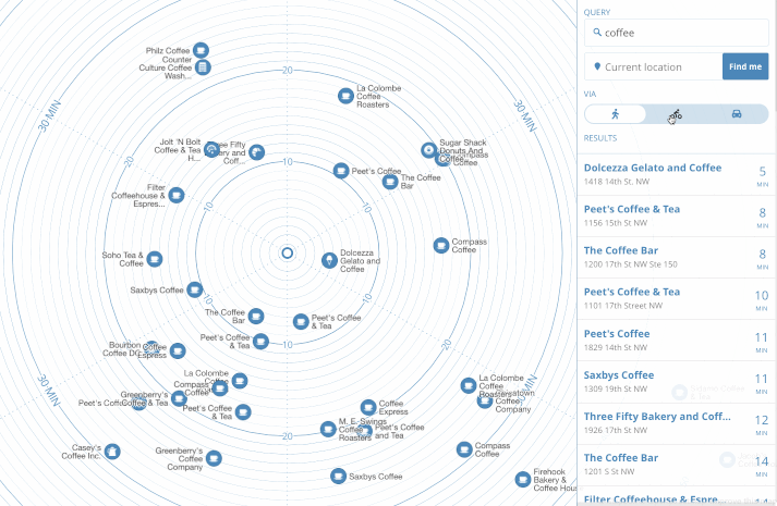
As you can see, the map puts you, the user, at the center. Each place’s direction is preserved relative to where you are at the moment. Concentric circles flow outwards indicating the time it would take you to reach that place, depending upon the mode of transportation you choose: Walking, biking or driving.
“By removing literal geography, we now have a map that more closely reflects the way we think about our environment: a cluster of restaurants ‘five minutes that way’ versus ‘ten minutes the other.’ We can watch our surroundings literally expand and contract with different means of travel,” Liu explains in a blog post.
Unlike popular apps like Google Maps or Waze, which allow you to see the ETA to your destination, the time map is designed to help you in situations where you don’t know what your Point B is. So, if you are looking for a coffee shop in the vicinity, just search for ‘coffee’ and you will see the result arranged by the time it would take you to get there. Once you zero down on one place, you will be able to see the directions in the usual ‘left turn-right turn’ format.
The current version of the map is just a prototype, and Liu is working on adding streets to his concentric circles. But the product is basically plug-and-play, which means it can be integrated into any app or service and programmed to use that app or service’s search functionality to generate results.
Check out the live map here.

#Business


Next article

Over the course of the Vietnam War, the United States and its allies dropped over 7.5 million tons of bombs on Southeast Asia. But until recently, no one outside the U.S. military really knew where all these bombs fell. That all changed in late 2016, when the U.S. Department of Defense released its Theater History of Operations (THOR) data, a comprehensive database of U.S. bombing missions from World War I through the Vietnam War. Touted as a means of increasing the public’s understanding of the U.S. military, the datasets were as rich as they were novel. And they simply begged to be mapped.
With Ken Burns’ documentary about the Vietnam War airing earlier this week, I thought it was a good opportunity to create an interactive Story Map exploring the Vietnam War dataset. To keep the piece short and sweet, I decided to focus on three different aspects of the aerial bombardment: the overall mission distribution; the actors involved (both by country, and by military branch); and the most significant operations. After processing and visualizing the data in ArcGIS Pro, I published it to ArcGIS Online and pulled everything into a Story Map Cascade. Then, it was just a matter of adding some explanatory text, creating some simple charts in Illustrator, and sorting through the troves of relevant public domain imagery.
The overall mission distribution map paints an interesting picture of the aerial campaign. The Ho Chi Minh Trail, the North’s primary supply line, is clearly visible, weaving sinuously through borderlands of Vietnam, Laos, and Cambodia. Central Ho Chi Minh City, the erstwhile capital of South Vietnam, was evidently spared intensive bombardment, but its surrounding exurbs were decimated. The area near the demilitarized zone was similarly pummeled with explosives; on the map, it stands out like a sore bruise. The data tells us a surprising amount about where, and how, the war was fought.
The subset maps, which isolate bombing missions based on the participating force (first at the country level and then at the service branch level), are equally illuminating. South Vietnam and Laos mostly carried out bombing missions within their own borders, as both countries sought to dislodge local communist guerrillas. Meanwhile, the United States struck targets up and down Southeast Asia.
Likewise, while the U.S. Air Force was active throughout the whole theater of operations, the U.S. Navy and Marine Corps operated within much more restricted zones, possibly dictated by the roles and ranges of their aircraft. Few of the Navy’s carrier-based planes ever ventured more than a couple hundred miles inland, while Marine Corps missions concentrated on areas of intense infantry combat, as its aircraft primarily operated in a close air support role aiding troops on the ground.
I was also interested in seeing which specific aircraft models spearheaded the bombardment. Although the prevailing image of the aerial campaign is a sheet of bombs tumbling out of a massive B-52 Stratofortress, it turns out that smaller, more nimble aircraft carried out the vast majority of missions. This closely aligns with the U.S. military’s prevailing doctrine of restricted warfare at the time. Only in the closing stages of the war did the U.S. unleash large formations of heavy B-52 bombers to decimate urban and industrial areas.
The data can be pushed and pulled in a million different ways, and it was exceedingly difficult for me to limit the scope of my story map. Which branch of the U.S. military flew the most daytime ground-attack missions in Cambodia? Which U.S. Air Force unit dropped the greatest overall tonnage of bombs? What was the average duration of carrier-based U.S. Navy missions? Was napalm used more frequently in some countries than others? These are all questions that I mulled at some point or another, and that I knew the data could answer. But sometimes, less is more. This story map, simple though it may be, already tells us a great deal about the conflict; it’s informative at a glance, but rewards deeper investigation.
I hope this story map will encourage others to explore the data, to address the questions I left unanswered, and produce their own visualizations. After all, that’s the fundamental purpose of the THOR initiative.