
“Every day, all over the world, ordinary people must flee their homes for fear of death or persecution. Many leave without notice, taking only what they can carry. Many will never return. They cross oceans and minefields, they risk their lives and their futures. When they cross international borders they are called refugees.” This is the entry statement of the great project called The Refugee Project which maps UN data about refugee migrations from 1975 to 2012.
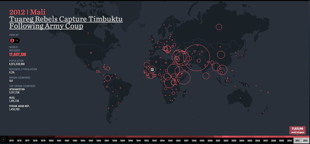
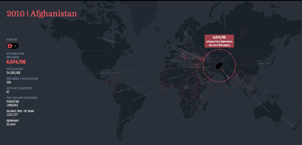
The project is the effect of collaboration between NYC-based design firm Hyperakt and designer Ekene Ijeoma, who contibuted 500 hours of volunteer work into building the website. The project gives some incredible insight into the growing amount of refugees world wide. There were 1.3 million of them in 2012 but the number grew up to nearly 18 million in 2012. In 2010 staggering number of over 6 mln citizens of Afghanistan had to flee or already have been away from their home country fearing for their lives.
The website also includes headlines for turning points in each country’s history, to help provide context behind the migrations. Deroy Peraza, Hyperakt’s Creative Director said:
There are small countries who at some point in history had a very large of their population leave, but they’re often not as big a story because the sheer volume of refugees is not as big as other countries. But to that country’s reality it must have been a tremendous impact.
From cartographic point of view I think that it’s a very good map. It clearly shows what authors wanted to present and there is no room for any misinterpretations. Amazing job!

#Ideas

Next article

What if all the ice melted in the world? Now whether you believe global warming happens because of human activities or naturally is another debate. The questions “How would the world look if ALL the ice melted?” What would be the extent of sea level rise due to rising seas? What would be the average temperature on Earth? are of interest to everyone.
Trust National Geographic not only to capture such questions in the best manner possible but also to visualize it in such geoawesome manner! Here’s the super interesting map by National Geographic “IF ALL THE ICE MELTED“!
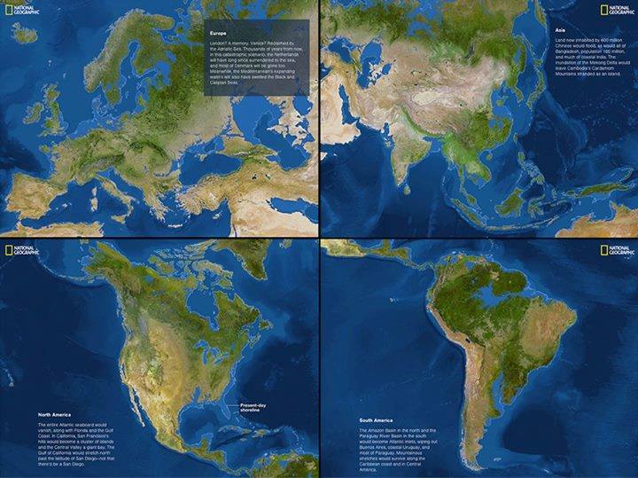
216 feet overall! Yup, that’s the level by which the sea levels are predicted to increase if all the ice melted into the oceans. It simply does not look the same, does it? Looks like I might to have look for another place to call home, if the sea levels rose tomorrow. 13.0839° N, 80.2700° E would be swallowed by the seas.
How does your place hold up?
Did you like the article about rising seas? Read more and subscribe to our monthly newsletter!