
 Social activism has taken to a different space – the internet. The power of internet based social activism is simply impressive and far reaching to say the least. Social media has been doing a phenomenal job of connecting people, addressing societal and governmental challenges. Geospatial technology has time and again shown how powerful is the Locational information and it is no surprise that social media is starting to adapt and embed the power of location in their applications and information transfer. Speaking of activism, I believe it is time to highlight a new and latest form of activism in which location information plays a key role – “Geo-Social Activism”.
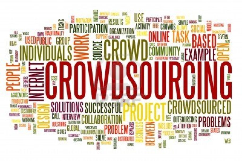
I love examples and here is one regarding Geo-Social Activism. Mumbai the commercial capital of India is a lovely city with a beautiful coastline and numerous other things that make the city what it is, but something that is very disturbing in the city is the Noise pollution level. The Awaaz foundation has been creating awareness about this problem since 2002. A month ago, their cause was reported by the Times of India and a prominent word that caught my attention in the heading of the article is “map”. The article is a reflection of how crowdsourcing of geospatial information is making social activism all the more effective and inclusive.
The foundation had asked citizens of Mumbai to record the noise pollution levels in their part of the city using an android application “Noisewatch”. Noisewatch is a simple app that records the decibel levels in your surrounding using the microphone in your smartphone. A simple idea combined with an efficient application has lead to better awareness and crowd participation in something that would have usually been the research thesis of an environmental sciences student which in the best case scenario would have just remained an academic exercise that never really made much of an impact. Enter Geospatial technology and smartphones, we have an entirely new phenomenon of Geo-Social activism where the “crowd” contributes to a cause that they can relate to and the best part of the entire exercise is that the final report is in a form that everyone understands – MAPS!
The exercise by the foundation was a big success and they were able to gather noise level information across the city. The biggest reason why the crowd was behind this exercise is because they were able to see their contribution immediately on the map! For the general public that is really encouraging and gave them a sense of ownership. It made everyone the owner of the map. The timely dissemination of the data gave the public a reason to participate. When you think about it, maps are probably the only advanced form of visualization and information where language is no barrier neither is your education level and is easy to understand 🙂
Oh yeah, the government in Mumbai finally realized the seriousness of the problem when a map was shown to them and has promised to work on it! Fingers crossed! Noisewatch is an application by the European Environmental Agency. The app is part of the initiative “Eye on Earth” by the EEA. The initiative is really interesting 🙂
So what you folks think about Geo-Social Activism? Let us know.
P.S: There is no such word as Geo-Social activism… But hey, someone has to coin a new word to explain geospatial tech in social activism 🙂


#Ideas


Next article

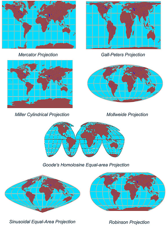 There are four basic characteristics of a map that are distorted to some degree, depending on the map projection used. These characteristics include distance, direction, shape, and area.
My article is not to discuss the benefits of map projections but to look at how technology is contributing to skills and knowledge being lost.
What four things do map projections distort?
As a cartographer with over 25 years experience in the GeoSpatial Industry, I guess I have a slightly more critical eye when I see maps that are produced these days. It makes me cringe when I see maps that are missing some essential items like a scale, north point, legends, projection information or title. It is so easy these days to just press the ‘print’ button and have the software spit out the map. It may portray the data in the way the ‘cartographer‘ indented but it looses basic usability outside the original production when it does not have these basic elements.
Are these basic elements being lost because it does not matter anymore or is it too easy to just rely on the technology and therefore too easy to overlook the basic elements. I feel it is more about the technology, although I do see there appears to be less importance placed on some of these at some levels of education.
Technology has become more than a tool to help us but more and more a tool to do the work for us. How many of you rely on ‘spell checker’ or ‘predictive text’ to correct spelling or grammatical errors? I know I do and my spelling has suffered at the hands of technology. I look at my children’s homework and am often amazed at the poor spelling and abbreviated words. How much more effort is to type ‘great’ as opposed to ’GR8′?
This sort of approach has crept into the ‘cartographers’ of today. Many maps are produced without really asking the question; “What is my final aim for the map?” and “Why was the original data produced?” Many data providers capture and store data that is useful on a statewide basis but if you are producing a local area map, maybe the data needs to be reprojected. Maybe the data was captured at 1:1,000,000 but you are producing a map at 1:50,000.
What was the original purpose of the data you are using for your maps? Have you read the metadata associated with your data, or did it even come with metadata. Too often I see data being used in a way that it was not intended. This maybe due to scale, symbology, attributes or just poor representation. There is a saying “garbage in – garbage out” and this is very true when it come to maps. Just because your GIS software can symbolise your data in a certain way, is this really enhancing or degrading the original data.
Before ‘computer assisted cartography” each map was produced for a specific purpose and the cartographer would know about the source of the information and why they were producing the maps. Many maps were a work of art and the essential map elements were there to make it useful to the end users. I am truly amazed looking back at the maps produced by the early explorers, like Captain James Cook who mapped Australia over 200 years ago. They mapped the coastline from their ships using what we might called primitive tools but it was amazing how accurate they were. Today we just pull up the latest satellite image, assuming that it has been rectified correctly and is fit for purpose.
Rather than just pressing the ‘print’ button, ask yourself is that map useful to the end user and have I used data fit for purpose. Know why you are producing the map, know why the data was captured. Take the time to bring out the cartographer in yourself.
—
Network with other Geospatial Professionals
www.geospatialconnect.com