
Geography and Maps have been used to depict a lot of information these days which traditional would have made it to a tabular list. I must admit some of this information have been really interesting to know. Yeah, I do have doubts about the inferences the authors make but nevertheless it is always interesting to see the research being depicted using maps.
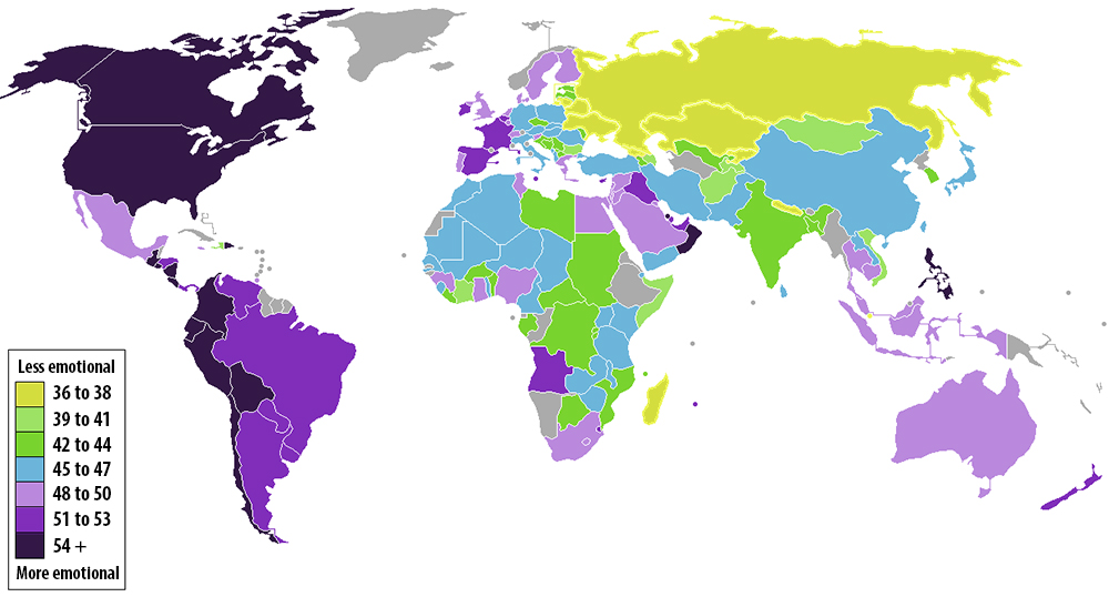
The Gallup polling firm has come out with an interesting research regarding “How emotional are people in your country are?” The research was started in 2009 and people from 150 countries were asked about their daily emotional experience among other things that are considered pointers to your emotional thinking.
The Survey had five questions, meant to gauge whether the respondent felt significantly positive or negative emotions the day prior.
” The more times that people answer “yes” to questions such as “Did you smile or laugh a lot yesterday?”, the more emotional they’re deemed to be. Gallup has tallied up the average “yes” responses from respondents in almost every country on Earth. The results, which I’ve mapped out above, are as fascinating as they are indecipherable. The color-coded key in the map indicates the average percentage of people who answered “yes.” Dark purple countries are the most emotional, yellow the least. Here are a few takeaways. “
If you are interested in the number and the exact questions, here you go!
Well, all I can say is “Interesting, but I am not too certain about the emotional outcome”. What do you think? Do you agree that your country is more “Emotional” than the others or vice versa…
P.S: I always thought Asian Countries are more emotional.. But, maybe I was wrong or am I?!
Geography of emotions! Let us know what you think!
Source: Washington Post


#Ideas


Next article
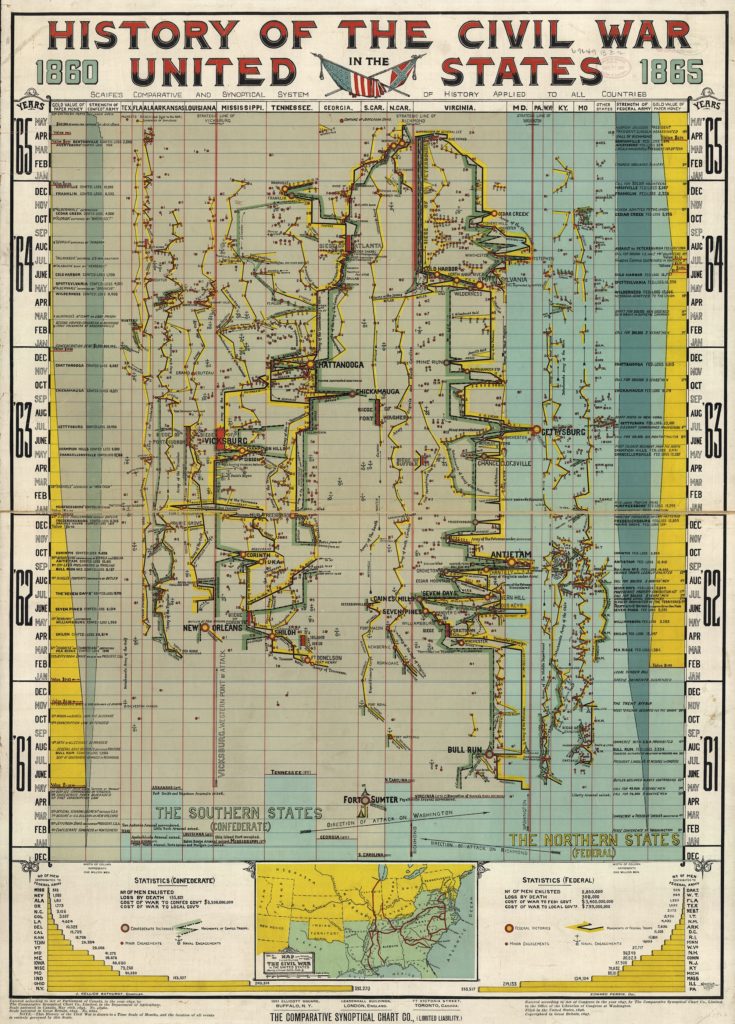
Did you think that infographics are a new trend in data visualization and mapping? You were wrong. Look at that visualization of the history of the Civil War 1860-1865. This is not a geographical map, but a historical time chart where the event of the war are drawn to a vertical time scale of months. The geographic dimension has been mapped on the horizontal scale. All events are mapped in a cause and effect sequence which is pretty amazing. But this is not all. It also maps the financial and human resources of both Federal and Confederate armies over time.
The “History of the Civil War in the United States, 1860-1865” was published by The Comparative Synoptical Chart Company in 1897 and its available in a high-resolution at the Library of Congress. Unfortunately the instructions on how to read it are lost but this is the greatest example that data visualization is not a new concept.
