
It is the love of maps and everything spatial that unites us and I can’t think of a better way to express it than by quoting Wisława Szymborska!
Flat as the table
it’s placed on.
Nothing moves beneath it
and it seeks no outlet.
Above—my human breath
creates no stirring air
and leaves its total surface
undisturbed….. (contd)I like maps, because they lie.
Because they give no access to the vicious truth.
Because great-heartedly, good-naturedly
they spread before me a world
not of this world. – Wisława Szymborska (Read the full poem).
Here is a collection of some of the most Geoawesome maps that were featured on Geoawesomeness this year, I’m sure, we missed many more interesting and Geoawesome maps, do send us all those cool maps that we missed out this year. Maybe we need a separate post for the maps that were featured on Facebook and Twitter alone.
For more Geoawesome maps, follow us on Twitter @Geoawesomeness and like us on Facebook/GeoAwesomeness and our twitter hashtag for maps is #GeoawesomeMapOfTheDay!
Geoawesome Maps
Since the new year is around the corner, check out this one on “Happy New Year Tweets“. Got more appetite for nostalgia, then “Travel back in time with Google Street View‘.
- Who thought Maps can be delicious as well? “Delicious Cartography“.
- Selfies are already part of the dictionary and everyone in the world is already used to this form of modern photography but which city really “loves taking selfies” – The selfie Map
- Cultural stereotypes can be sometimes funny: The Map that divides Europe based on such lines
- Humanity’s cultural history mapped in a 5 minute video map
The Power of Maps
Maps are not only a really nice form of visualization, they can help make a statement as well!
- Maps can not only visualize crime but can also help combat it: How maps are helping law enforcement in South Africa
- The Map that reminds us that world still needs peace: The last 4o year Refugees map
- Political boundaries are slowly starting to fade away: The World divided by Airports
- Traveling between A and B can be beautiful too: The scenic route algorithm
- Maps and Urban planning insights: What overlaid paths can say about a city and Street grids visualization map
Augmented Reality Maps
Augmented Reality and Geospatial Tech go hand in hand, there have been a lot of really cool augmented reality applications using Geospatial data, Audi showcased a really cool augmented reality table map at CES 2014!
Map Art
If you ask a cartographer, they will surely agree that Maps are a piece of art but what happens when you convert a map into another form of Art. Find out more
Interactive Maps
- The Geotagged Tweets Map
- The Interactive “Taxi trips map of NYC“
- The NYC “Access to Jobs Map“
- Barcelona is certainly a beautiful city: The Architectural history Map of Barcelona
Maps Search Engine
- Sometimes, it can be tiring to search for Maps. Thankfully, Google Maps Gallery promises to be the map search engine of the future (read more).
- The WikiMaps project: Building together an open collection of Historic maps
Global Warming
- The Map that shows temperatures in 2014: The hottest year in recorded history.
- What happens if all the Ice melts? National Geographic has mapped the answer to that question.
- But things are not totally lost, the global biodiversity atlas map still has some good news


#Featured


Next article
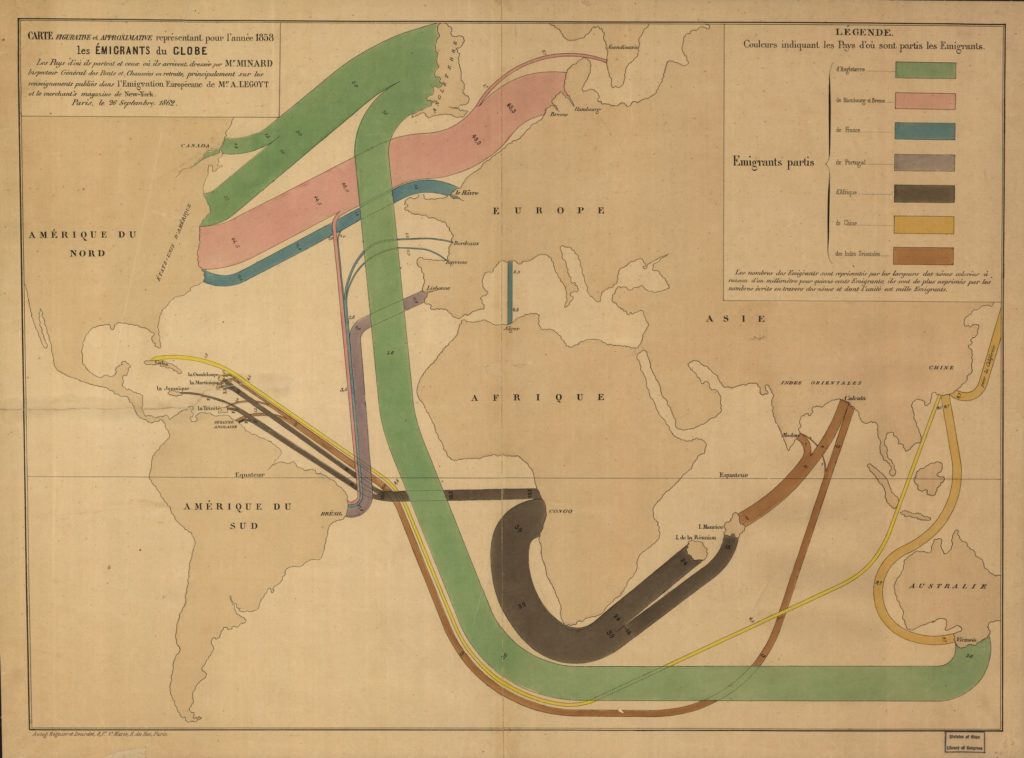
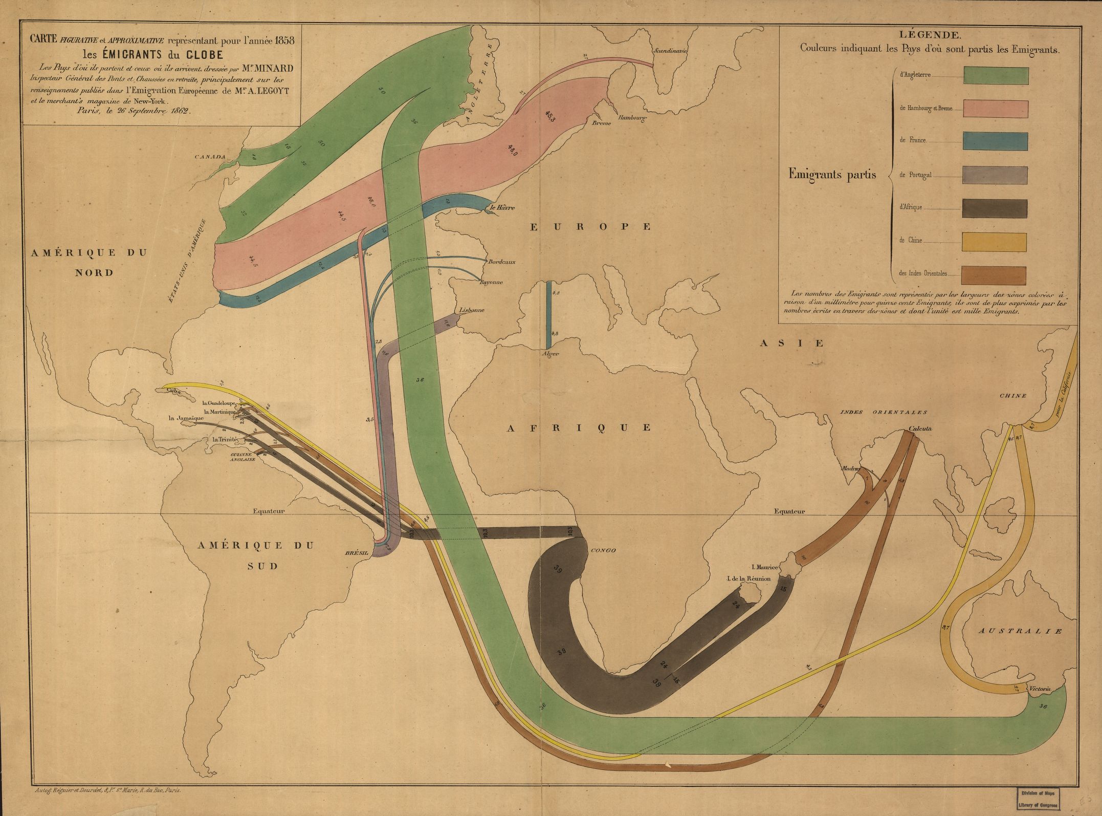
Mapping migration patterns is one of the most basic yet complicated challange of every cartographer. Today and 2 centuries ago. A French archival map designed by a French engineer, Charles Minard in 1858 shows one the approaches of mapping the spatio-temporal changes to distribution of a phenomena.
Charles Minard was the one who pioneered the “flow line” – a cartographic presentation method which is considered to be modern still today. With this tool Minard was able to map three dimensions: the route, the type (colour) , and the size of phenomena (using the width of the flow line). When you compare this map from 1858 with a modern flow line maps, you can spot one interesting difference. 150 years ago the phenomena were mapped from a port to port via ocean routes. Today we would rather map it from a centroid to centroid or a capital to capital typically using the shortest path.
Matthew Edney, professor of the history of cartography at the University of Southern Maine, commented on the map of Charles Minard:
This focus [on flow] perhaps stemmed from his professional work as a civil engineer who specialized in bridges and canals, that is, with managing the flows of traffic and water.
Although the map has been designed back in 1858 and therefore the data presented is not very accurate, the map looks great and strikingly modern.
source: CityLab