
Apple Maps are slowly becoming a decent product. Many users especially in the US are starting to use Apple’s default maps instead of Google Maps.
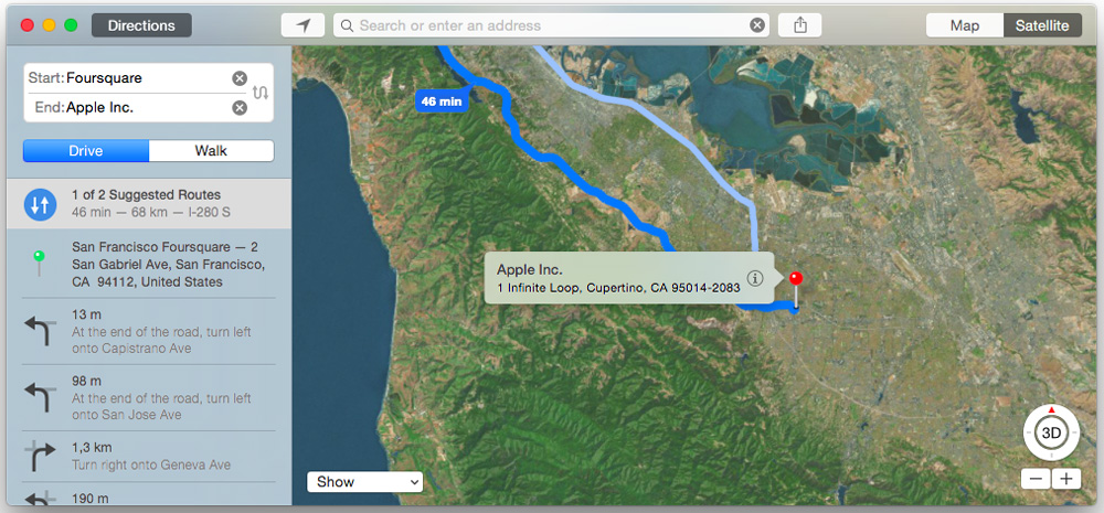
One of key element of a good mapping portal is a databases of POIs like stores, restaurants, and hotels. Last year Apple started to use content from Booking.com, Yelp and TripAdvisor. Recently Andrew Shotland noticed that a new brand has been listed in Apple Maps’ acknowledgements and copyright page – Foursquare.
It is not clear how Apple is combining all these data sources. Most likely the company uses Locationary engine to do that. Apple bought this Canadian start-up back in 2013. Locationary created a technology which allowed to merge, clean, enhance and redistribute various location datasets. The company was then selling these improved data sources back to publishers and developers.
Foursquare claims to have over 2 million businesses in its database and over 70 million tips submitted by users, so it’s definitely a valuable datasource. Let’s see how well will Apple use it.

#Business

Next article
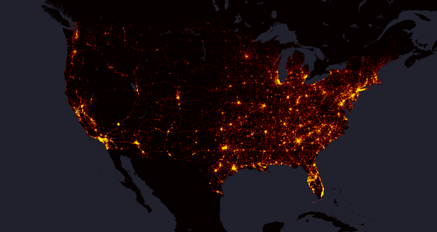
Interesting mapping project shows location of every fatal traffic accident in the US between 2004 and 2013. Based on data from the Department of Transportation’s Fatality Analysis Reporting System (FARS) the map visualizes 373377 data points in total.
The map has been created by Max Galka, a “data cruncher” who cofounded real-estate venture Reevaluate. At the national level the map is similar to any human activity map e.g. Tweets Map by Mapbox.
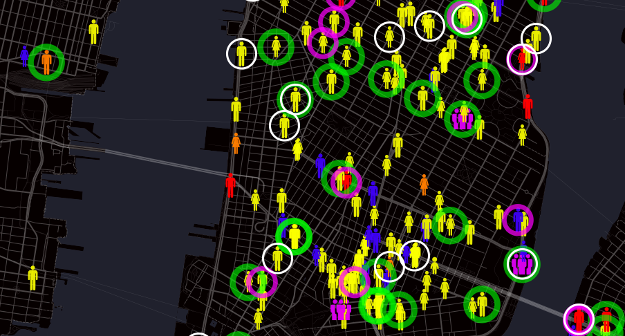
When zoomed in, each icon’s shape and color represent information about a particular victim. Icons represent women, men, and children and different colors identifies whether the person was a driver, a passenger, a pedestrian or a cyclist. Galka also highlights accidents which happened as a result of 3 main fatal accident caused: alcohol, speeding, or distracted driving.
It’s really striking. Check out the interactive map online.