

“Pay-as-you-fly” drone insurance? Yup, there is an app for that. Allianz Global Corporate & Specialty, the corporate insurance carrier of Allianz, announced that it has partnered with a London-based start-up Flock to develop digital insurance solutions for drones. Allianz and Flock are set to launch a mobile app later this year for the U.K. market that enables operators to purchase ‘pay-as-you-fly’ drone insurance at the touch of a button. 
“Pay as you fly” drone insurance and Geospatial data
Globally, the market for commercial applications of drones is set to reach $127 billion by 2020 (PwC report), automating a lot of work that is currently being carried out by humans. As drones take over my skies, safety becomes a priority with drone insurances playing a pivotal role in protecting drone operators and the public from the risks of drone flight.
The interesting aspect of this story is how Flock computes the risk factor for a drone flight using real-time, location-based data. Flock’s algorithms utilize weather data, nearby buildings, local flight restrictions, details regarding your drone and your profile to evaluate your risk factor and provide you with the “pay-as-you-fly” drone insurance that is underwritten by Allianz.
Flock is also one of the members of the Geovation program in the U.K. that is supported by Ordnance Survey.

How does Flock compute the risk factor for your drone flight?
It’s going to be interesting to see how the drone insurance market shapes up and what role geospatial analysis will play in migitating potential risks of drone flights. Flock with its data-driven approach to drone insurance definitely has an amazing journey in front of it 🙂


#Business


Next article
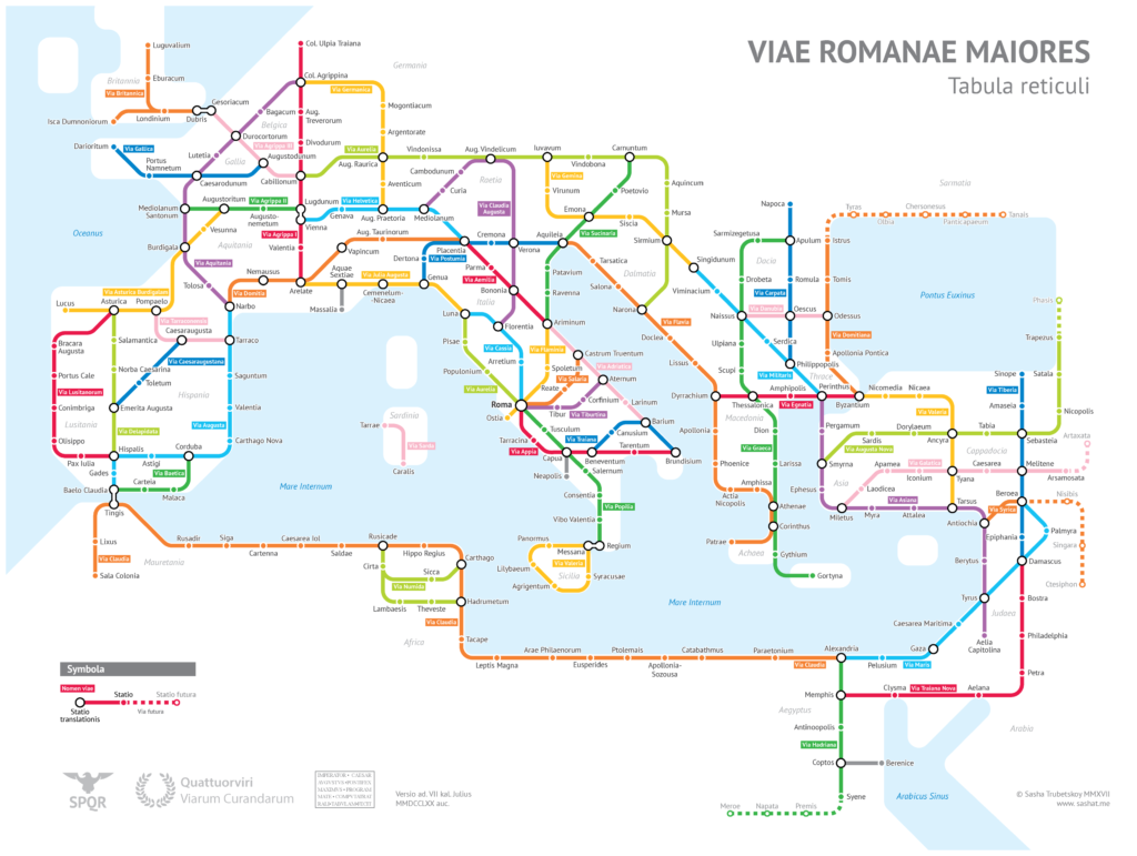


A subway-style map of the major Roman roads, based on the Empire of ca. 125 AD
Maps were always his best companion – be it spending hours with the Geographica illustrated world atlas at the age of 3, or copying the map of mineral deposits in North America with crayons when he was only 5. Maps alone could satiate the voracious analytical appetite of Alexandr ‘Sasha’ Trubetskoy.
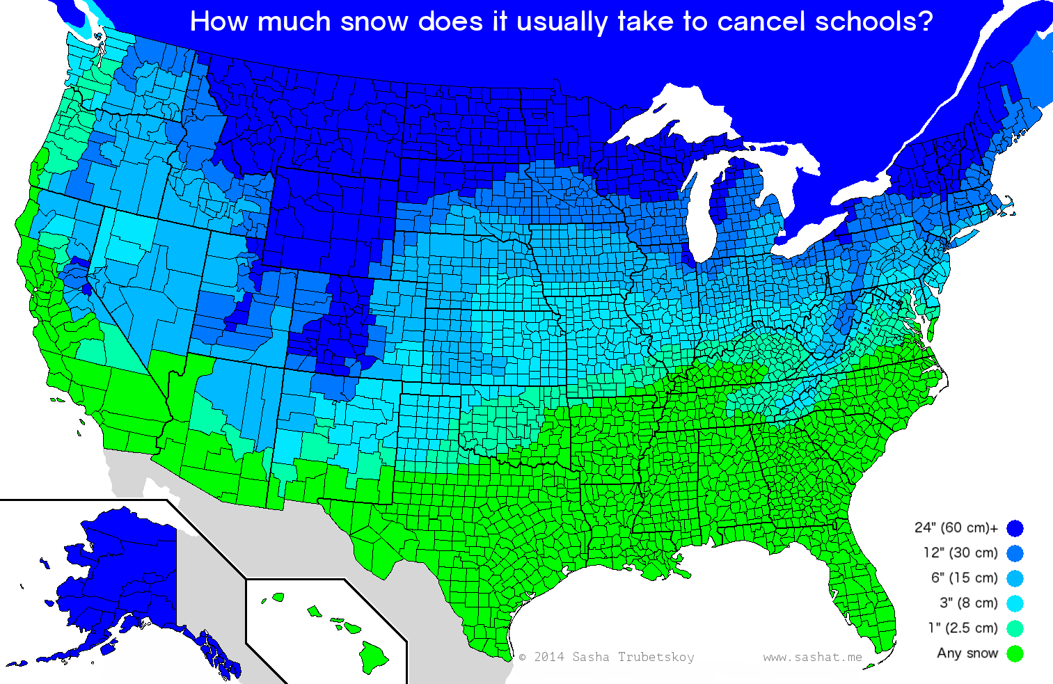
But it wasn’t until the 11th grade, when one of his ‘hobby’ maps landed on the front page of The Atlantic, that Sasha realized cartography was something special. “That’s when my mind truly started racing,” Sasha tells Geoawesomeness. “I had never felt so validated in my life. I realized that people were actually interested in maps like ‘How much snow it typically takes to cancel school in the US,’ and that I should really dedicate more time and effort to this.”
Between studying statistics at the University of Chicago and juggling a couple of part-time jobs, Sasha’s schedule is pretty tight. But when the 20-year-old who was born American, raised Russian does manage to squeeze some time out, there’s a good chance the map he’s making would go viral.
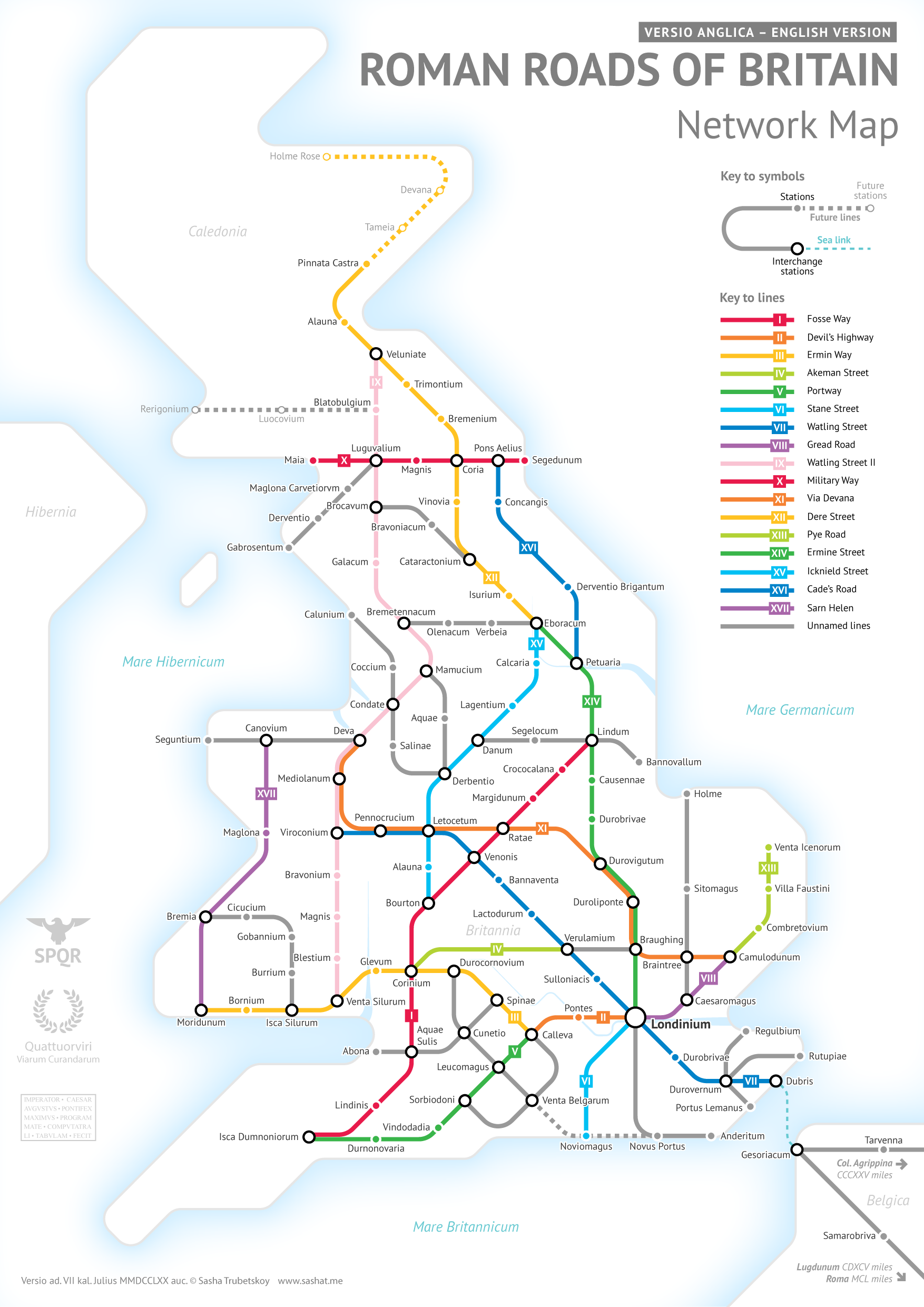
Take his most recent creation as an example. A subway-style map plotting the roads of the Roman Empire became so popular when it came out last month that the young cartographer was bombarded with fan requests to make another version of the map – this time focusing exclusively on Britain. And fulfilling the hundreds of print requests he’s received for the map has been as demanding as a full-time job. “It’s the first map that actually paid for itself, and now I’m realizing I can make a living from this,” Sasha smiles.
Ideas come spontaneously to this data nerd, usually in the form of a question, like I wonder what cities are mentioned most frequently in the movies. This is followed by some sort of research or data collection to answer that question, e.g., writing a python script to scrape 16,000 movie scripts and running some text analysis.
Gathering good underlying data is something this mapping wizard would never compromise on. “There are too many maps on the internet showing ‘top Google search by state’ or something silly like that, where the data are completely meaningless and can be arbitrarily manipulated — but the casual Buzzfeed reader doesn’t know that, and people end up drawing false conclusions. Making a map that’s both good looking and not misleading is a huge challenge,” he stresses.
The making of the map is, in fact, the most involved step. Sasha would go through several iterations until he can find something that he thinks looks good as well as answers the question effectively. “Deciding on the layout, the positioning of graphical elements, color scheme, which details to include and which to leave out are exhausting decisions and take a lot of creative brainpower. I usually go straight to bed after a few hours of designing. My brain is fried.”
Over the years, Sasha has graduated from drawing pixels by hand in GIMP to using GIS software and coding, coupled with Illustrator. The artist in him has embraced the tools to make the maps as rigorous as possible. “Everything has to be scientifically calculated in order for an analysis to be valid. Nobody trusts a random guy’s intuition,” he smiles. “Having a rock-solid methodology shifts the discussion away from the validity of the claim, and more towards its interpretation.”
But when some critic decides to quibble about a certain detail on the map, Sasha is already armed with a response. “Anything that’s not mathematically calculable is up for debate,” he admits. “I can usually foresee potential issues. So when the inevitable remark comes up, I can give a well-reasoned response for why I did things the way I did. Most critics are surprised that I even took the time to write such a thorough response, and are very understanding once I’ve explained myself.”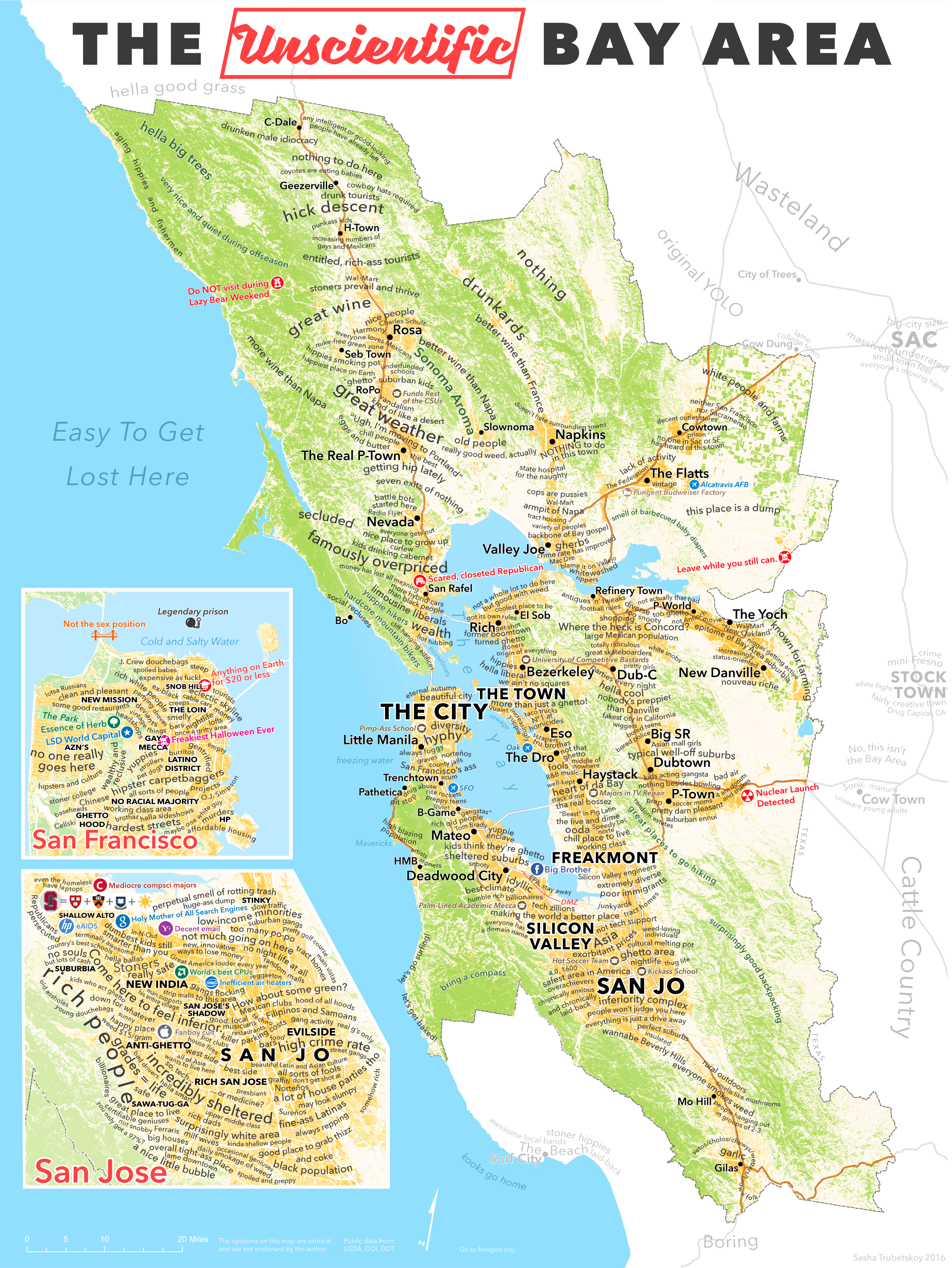
Ask Sasha about his most cherished map and he quickly settles down on the Unscientific Bay Area map. “I put a lot of effort into it, and I love the polarized reactions that I get – ‘How dare you perpetuate stereotypes!’ vs. ‘Haha, this is so accurate!’ Plus, I think it just looks great.” We agree, Sasha. We totally agree!