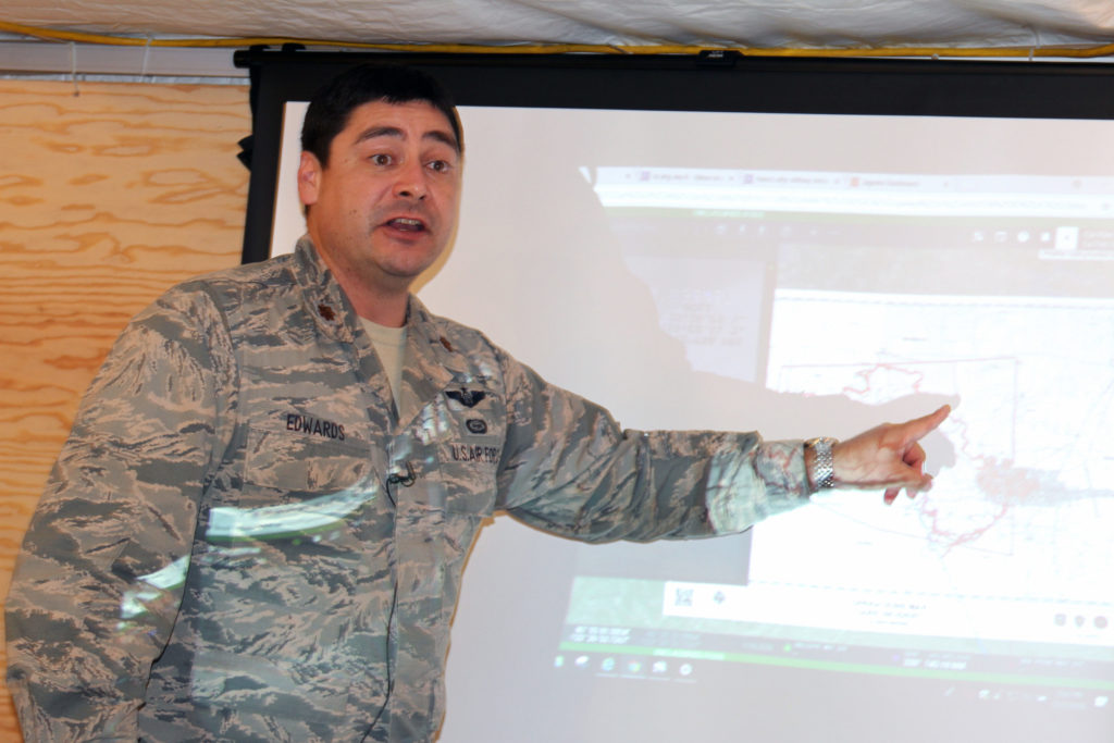


Air Force Maj. Nicholas Edwards, an intelligence analyst manager with the California Air National Guard’s 195th Airlift Wing, updates leaders from the California Department of Forestry and Fire Protection on the Carr Fire in Shasta County, Calif., July 30, 2018. Army photo by Staff Sgt. Edward Siguenza
Unmanned aerial vehicles or drones have quickly become vital components in the rapidly advancing technology for wildfire spotting and management. In California, Air Force drones have been mapping wildfires since 2017, helping frontline responders to fight fires more aggressively and with heightened situational awareness.
But wildfire is a disaster where every minute matters. And traditionally, the process of creating a map from a drone surveillance video could take anywhere from 3 to 6 hours. This means fast-moving flames could make a map out-of-date as soon as it is generated. And with wildfires growing bigger and moving faster than ever, their management has become nothing short of a multidimensional logistical hell for firefighters.
Enter, artificial intelligence. This year, the Pentagon is testing artificial intelligence algorithms that can automatically scan drone videos and generate fire maps from them within minutes, WIRED reports. Already, the technology has shown promising results as it helped the California Department of Forestry and Fire Protection, aka CalFire, to plan a response to the explosive Creek Fire near Yosemite National Park. And now, the Pentagon is mulling a nationwide rollout of its AI software in preparation for the next year’s fire season.
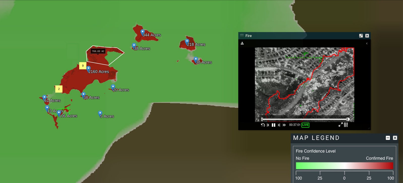
An AI system developed by the Pentagon generated this map of wildfire activity near Santa Clarita, California, from video collected by a drone in 2019. Courtesy of the Air National Guard, via WIRED
WIRED explains how the auto-mapping software works. Algorithms digest video frames from past fires labeled by humans to demonstrate how flames and fire boundaries should be geotagged.
As part of the Pentagon’s plans to work closely with the tech industry to tap into commercially-available AI algorithms, startup CrowdAI was roped in to annotate examples that would train machine-learning algorithms to take in fresh infrared drone imagery tagged with location data, and spit out digital mapping files shaded to show areas that are burning. Spot fires are marked too.
And although the Air Force’s MQ-9 ‘Reaper’ drones fly at upwards of 20,000 feet, their powerful cameras allow the maps to show fires to a resolution of 90 feet. As of now, analysts still check the final output. But eventually, with continued reliable results, the technology can be directly integrated into CalFire’s workflows, allowing firefighters to access fresh maps in the field through their mobile devices.

#Business


Next article

With the coronavirus pandemic continuing to spread in many countries as economic activity revives, Google has ramped up its efforts to help people stay safe when they’re out and about. The next time you fire up the latest version of Google Maps on your smartphone, you will receive an option to activate COVID-19 data on the map.
By enabling this layer from the top right corner layers button on the app, you will be able to see the seven-day average of confirmed coronavirus cases in an area per 100,000 people. The layer display is color-coded to indicate whether cases are increasing or decreasing.
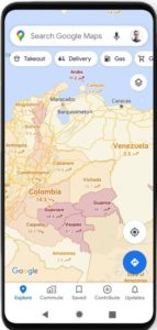 The layer’s colors indicate:
- Grey: Less than 1 case
- Yellow: 1-10 cases
- Orange: 10-20 cases
- Dark orange: 20-30 cases
- Red: 30-40 cases
- Dark red: 40+ cases
“Trending case data is visible at the country level for all 220 countries and territories that Google Maps supports, along with state or province, county, and city-level data, where available,” Sujoy Banerjee, Product Manager, Google Maps, explains, adding that the feature is being rolled out to both Android and iOS users simultaneously.
The data for this new Maps layer comes from multiple sources. These include authoritative sources, such as Johns Hopkins, the New York Times, local health agencies, and municipal corporations. But interestingly, one of the data sources is Wikipedia. Google already relies on these sources to power COVID case information in Search, and now this capability is being expanded to Google Maps.
You may recall that Google first updated Maps with new COVID-19 travel alerts when cities first started to reopen in June. The navigation app tied up with local transit agencies to tell commuters if their trip was likely to be affected by COVID-19 restrictions, and notified drivers about restrictions along their routes.
Google Maps’ crowdedness prediction feature for public transit is also helping users to see the times when a transit station is historically more or less busy, while also allowing them to check for insights like temperature, accessibility, and security onboard.