
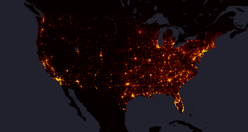
Interesting mapping project shows location of every fatal traffic accident in the US between 2004 and 2013. Based on data from the Department of Transportation’s Fatality Analysis Reporting System (FARS) the map visualizes 373377 data points in total.
The map has been created by Max Galka, a “data cruncher” who cofounded real-estate venture Reevaluate. At the national level the map is similar to any human activity map e.g. Tweets Map by Mapbox.
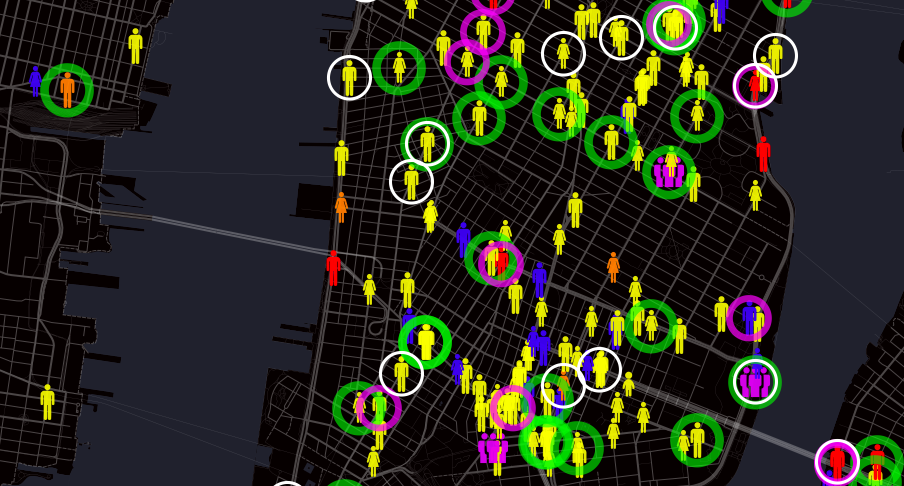
When zoomed in, each icon’s shape and color represent information about a particular victim. Icons represent women, men, and children and different colors identifies whether the person was a driver, a passenger, a pedestrian or a cyclist. Galka also highlights accidents which happened as a result of 3 main fatal accident caused: alcohol, speeding, or distracted driving.
It’s really striking. Check out the interactive map online.

#Ideas


Next article
Winter is coming. As a backcountry skier every year I wait for it the whole summer. If you’re also waiting for the first snowfall, you will like the map recently released by the National Oceanic and Atmospheric Administration (NOAA).
The map shows historical data of the first day of snow for an average year across cities in the US. It gives us skiers an idea of where to find early snow to start a winter season. The map is based on 1981-2010 historical patterns. “It isn’t the average date of the first observed snowfall. Technically, it’s the date by which there’s a 50% chance at least 0.1” of snow will have accumulated”, we read on the project’s website.
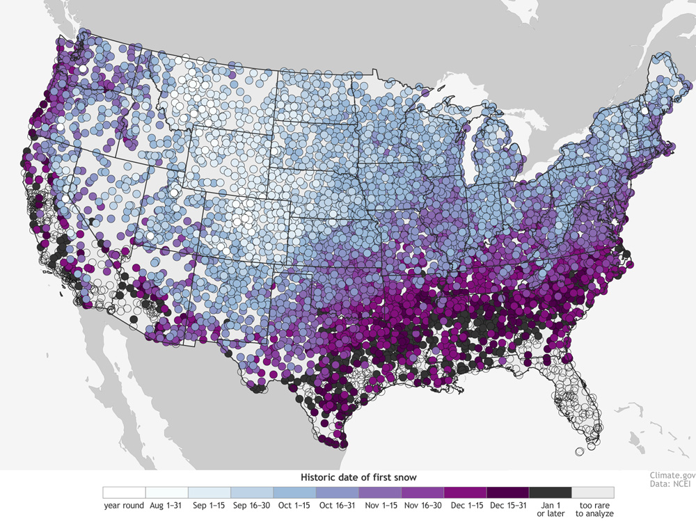
There are some obvious trends in the map. First of all the snowfall depends on latitude and altitude. The farther north and the further up you are the earlier you may see snow.
“The highest elevation stations along the spines of the Rockies have a year-round threat of snow. On the other end of the spectrum, the Deep South, Gulf Coast, Desert Southwest and Hawaii have many stations that get snow so infrequently, there’s no date listed (empty circles). In these places, there just aren’t enough events to make robust statistics.”
Cartographically speaking the map is not beautiful but it serves its purpose well. The “cloud” of dense points makes at that scale a kind of a heat map. Cool.
source: NOAA