
Its amazing to see how a seemingly “boringly scientific” question turns can be turned into fascinating and informative one with the right visualization techniques and tools.
Line Of Sight by Patricio Gonzalez Vivo
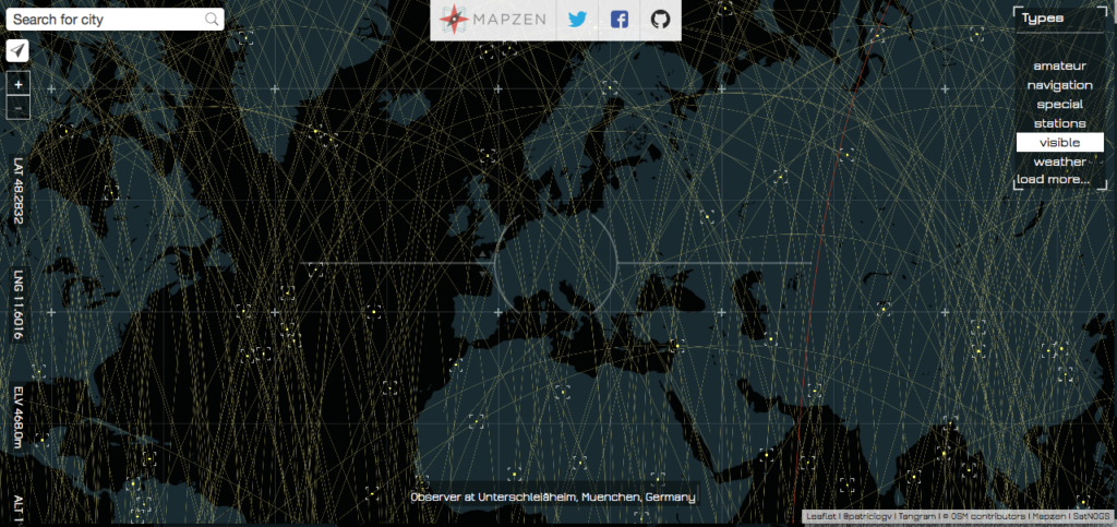
Line Of Sight
“What are the satellites in your line of sight?” seems like a question that only a space science enthusiast might be interested in but then Line Of Sight, an open-data visualization by Patricio Gonzalez makes it really interesting and informative! It’s really fascinating to see how many satellites are whizzing past us every minute – here’s the link to geoawesome visualization. Satellite gazing was never this cool 😉
 More info:
If you are interested in finding out more about the code behind the project – here’s the link and here’s the link to the data behind the project. Happy satellite gazing!


#Featured


Next article
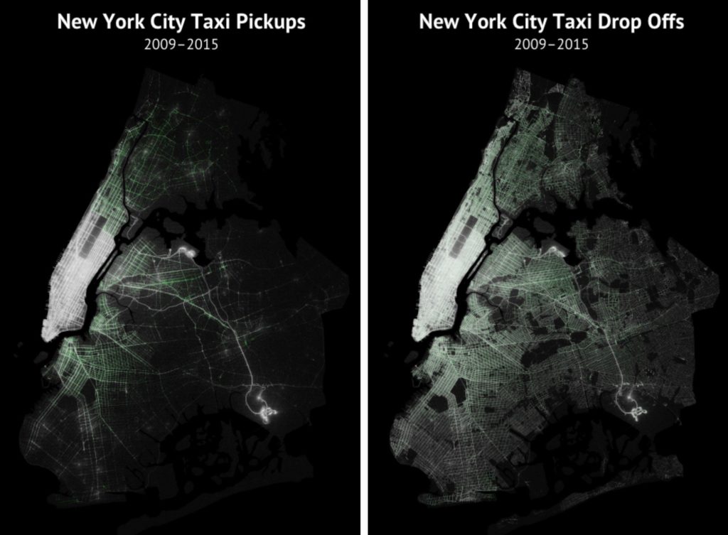

Truly amazing visualisation created by Todd W. Schneider shows 6 years of taxi trips in NYC. Todd took a huge data set recently released by the city’s Taxi & Limousine Commission that contains over 1.1 billion taxi trips from 2009-2015. He combined it with publicly available Uber datasets of nearly 19 million rides in NYC from April–September 2014 and January–June 2015.
The effect of this exercise can be observed on two amazing maps: NYC pickups and drop-offs. You can check out high res images here and here.
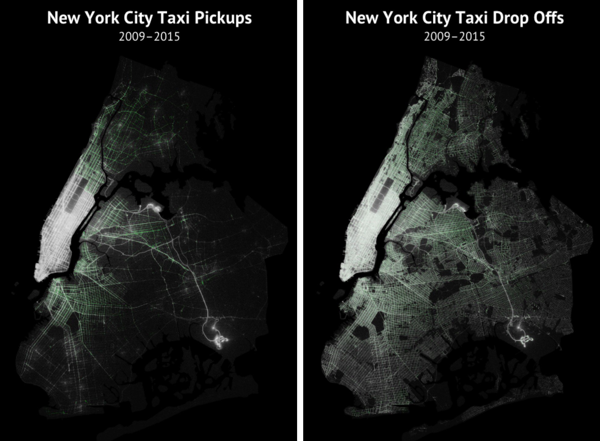
Every pickup and drop-off is represented by a single dot. Brighter regions indicate more taxi activity. Traditional yellow cabs are represented in white and the green tinted regions shows green boro taxis, which can only pick up passengers in upper Manhattan and the outer boroughs.
The first observation is that pickups are more concentrated in Manhattan and drop offs extend further into the outer boroughs. We can also see high activity around JKF and LaGuardia airports. Would be really good to zoom in and look deeper into this data. Todd is sharing the project on GitHub, if anyone fancy to play around with it in Mapbox or CartoDB.
Truly geoawesome project.
via: Vox
source: Todd W. Schneider