
You’ve been living in a lie all your life. Everyday billions of searches are made on Google Maps, helping people navigate their way around the world and Google claims that it is on a ‘never-ending quest for the perfect map’, but the truth is that the geography of the world which you’ve been showed is a lie.
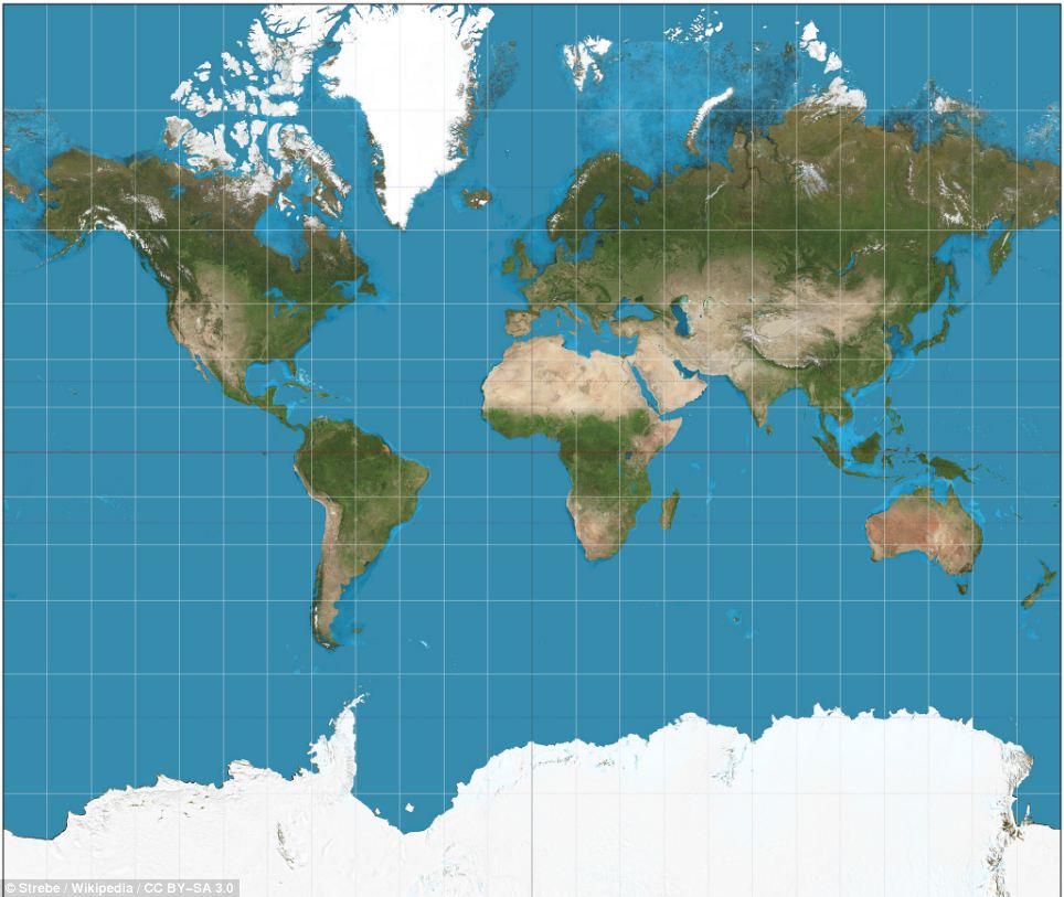
World according to Mercator projection
When you look at the map above, which is the one you typically see in the Internet, North America and Greenland looks larger than Africa. In reality, you can fit north America into Africa and still have plenty of space for India, Argentina and Germany. The map suggests Scandinavian countries are larger than India, whereas in reality India is three times the size.
The distortion is the result of the Mercator projection which was created in 1596 to make life easier for sailors by keeping parallels and meridians as straight lines. But in doing so it distorts the world in a way that misrepresents countries’ shape and size to a degree that increases the farther away they are from the Equator. This ‘favours’ rich north countries by showing them as much bigger than in reality. The map below shows the World in Gall-Peters cylindrical equal-area projection which makes seeing the relative size of places much easier. The project distorts the shapes, distances and angles so certain places appear stretched and this is why we rarely observe it online.
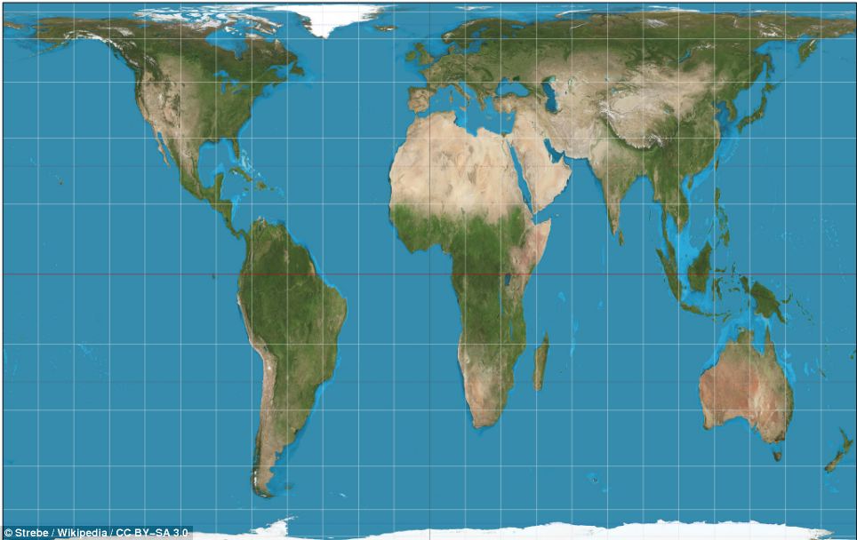
World according to Gall-Peters projection
This video from BuzzFeed will give you a glimpse of how could you actually compare sizes of different continents and countries. I hope it will change the way you look at the map of the world.
Conclusions? There is no such thing as a perfectly accurate map. All maps distort reality and convey bias. You must be aware that Mercator projection is which really good for a large-scale (close view) navigation purposes is not the best option to present the world in a small-scale (global view). As geo-geeks we should try to use different map projections for different purposes. With modern mapmaking software, choosing a different and more appropriate projection is quite easy. Perhaps the time has come to abandon reliance on the Mercator projection for every purpose. Don’t you think?
sources: Buzzfeed, The guardian, The economist, Dailymail
DID YOU LIKE THE POST?
SUBSCRIBE TO OUR WEEKLY NEWSLETTER
[wysija_form id=”1″]

#Business


Next article

Geo-geeks from all over the world! We’ve got already the 14th week of the year which means the 10th GeoawesomeQuiz! Remember to share you score with the World!
[mlw_quizmaster quiz=14]